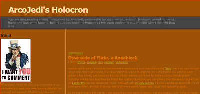
Updated Template Again
 It was pointed out to me by my dad in a blog comment that the design I was using was not really all that great, especially on certain monitors or in high contrast settings. I rearranged the colors again and do I hope I've improved it. Posted here for your comedic pleasure is a screen shot of the old look. Thanks!
1 comment:
Likes the Template. Thanks for the comment. I'm a big batman fan, probably a bigger star wars fan.
Post a Comment